|
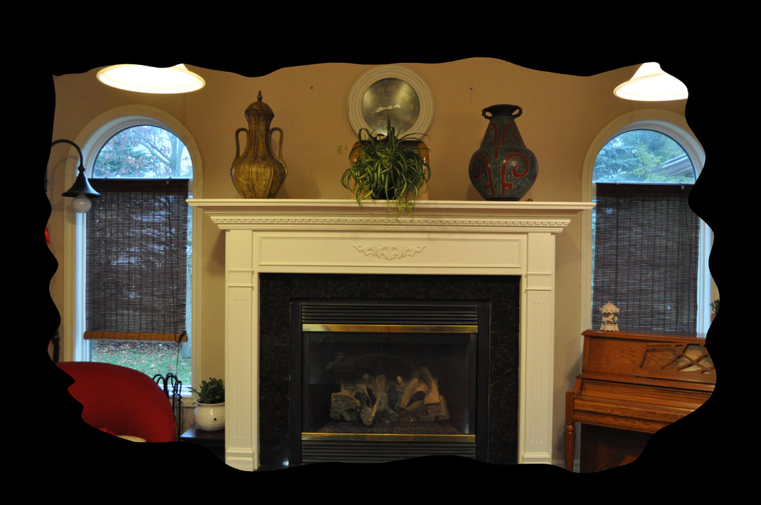
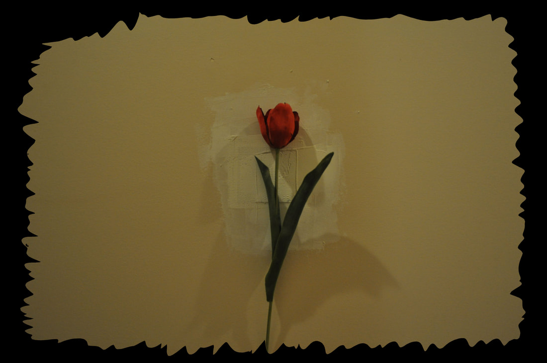
In this assignment we are two take any eight pictures and add these unique frames to each of them. Clipping Mask Frame
Gallery Frame
Gaussian Blur Frame
Sprayed Strokes Frame
In the end of the assignment I was really able to learn how many different ways and many different methods of framing your photos in Photoshop. A person could frame a photo in Photoshop using a multitude of different tools or a combination of them.
0 Comments
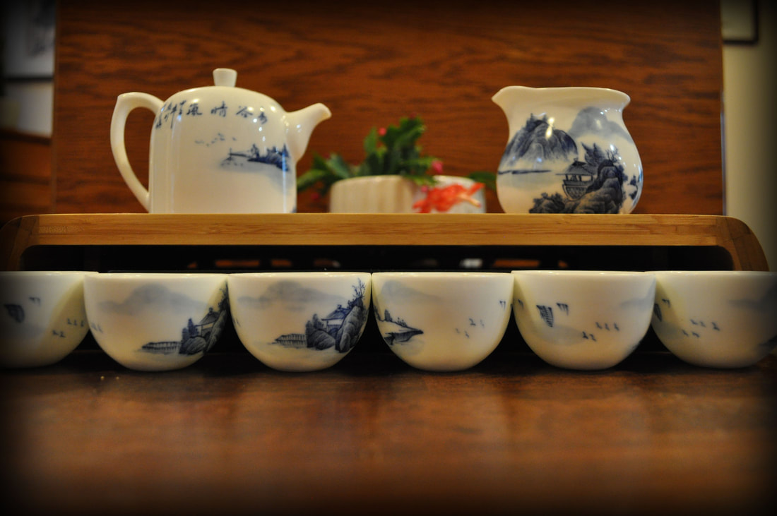
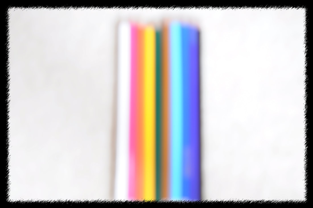
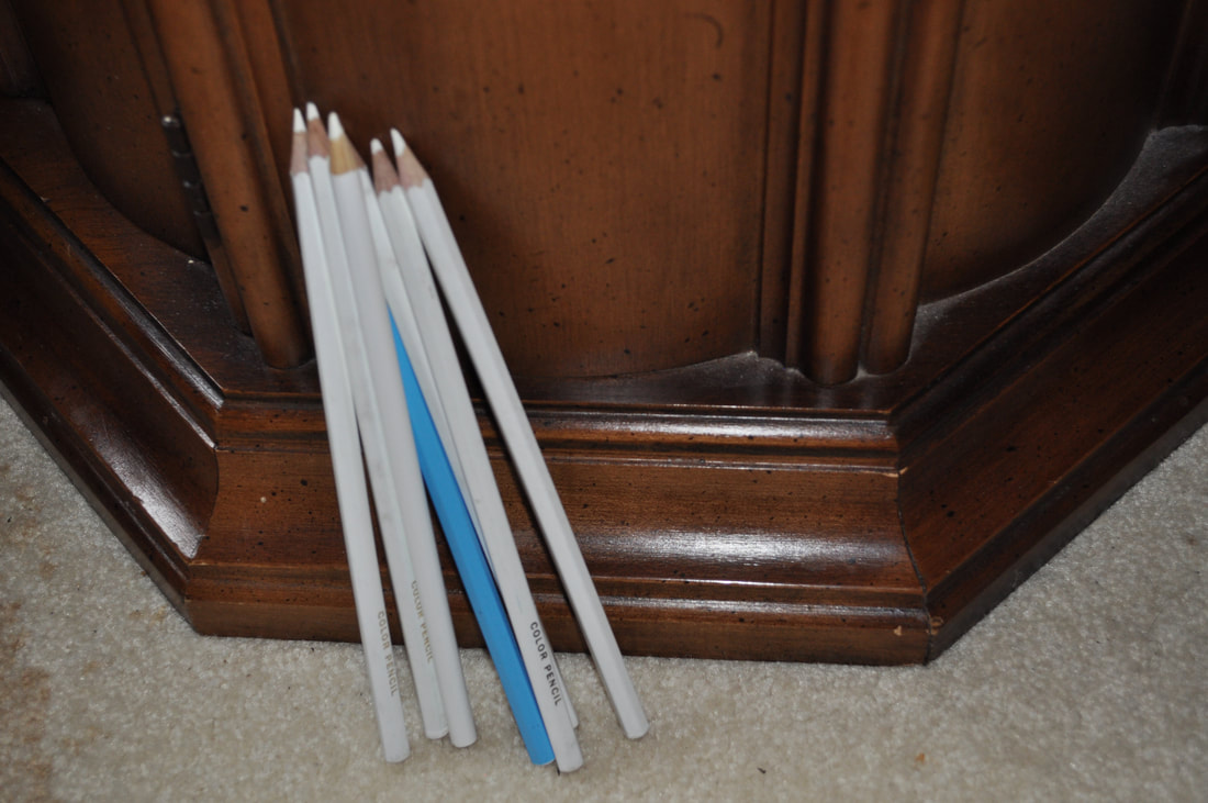
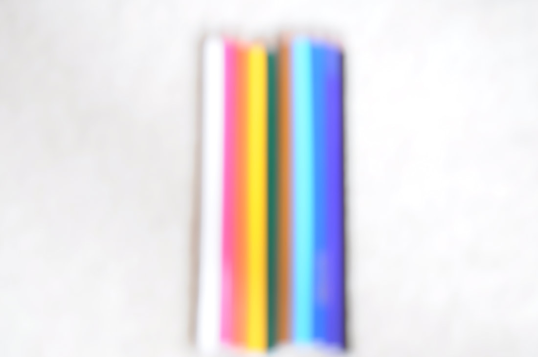
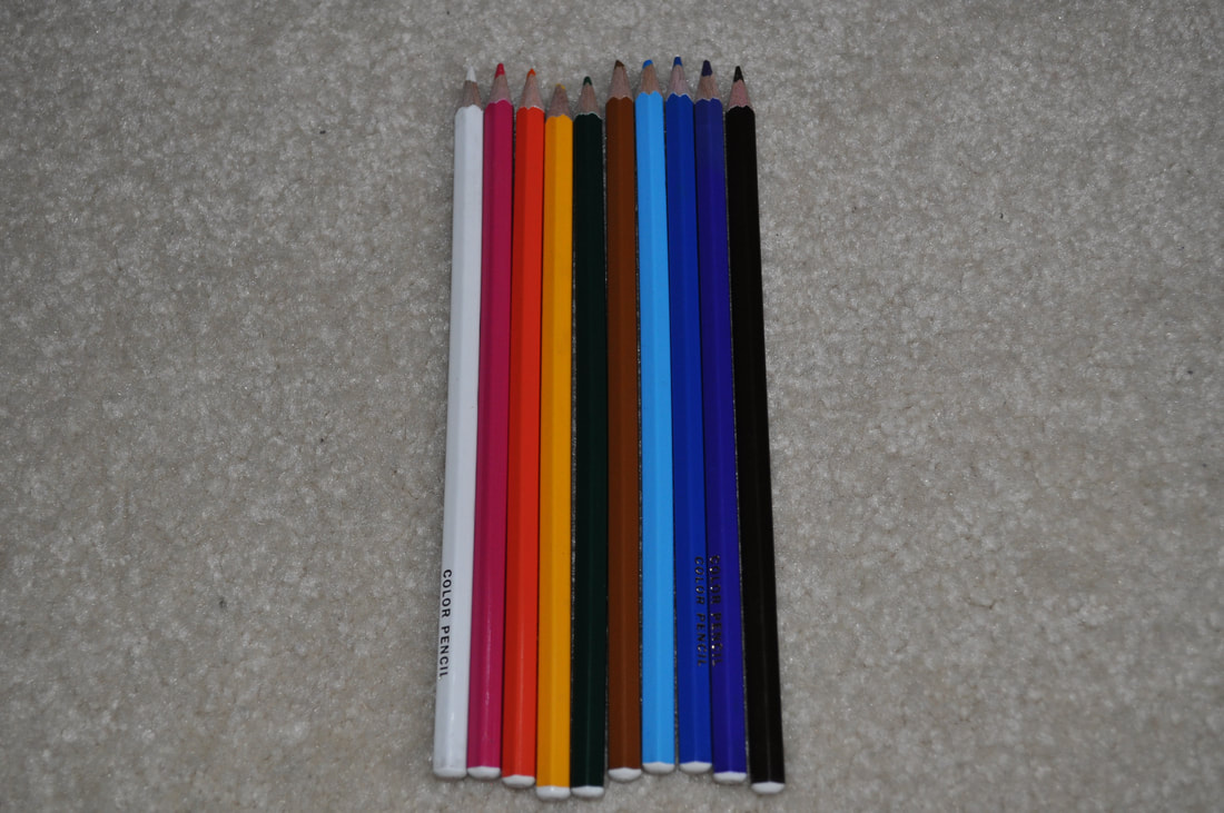
In this assignment we are to take pictures relating to the topic of color. As long as the image represents some kind of contrast or strong relation to colors then it's good. Best Photo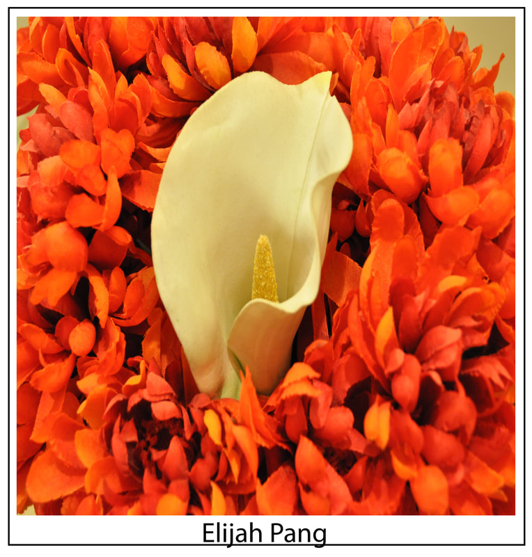 Next Five Best:
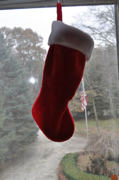 While taking these pictures it had me thinking what do colors mean for photography? There are colors everywhere, but what makes it special is how colors interact with the world. In my pictures I tried to have the colors clash with it's surroundings or make it pop out more.
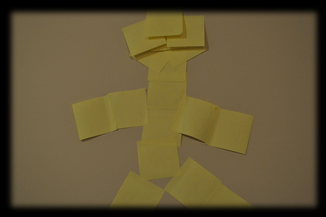
This assignment has us students take pictures with certain principles of design. Then after taking the photos we need to write each of the principles and design's definitions with a description and summary. Balance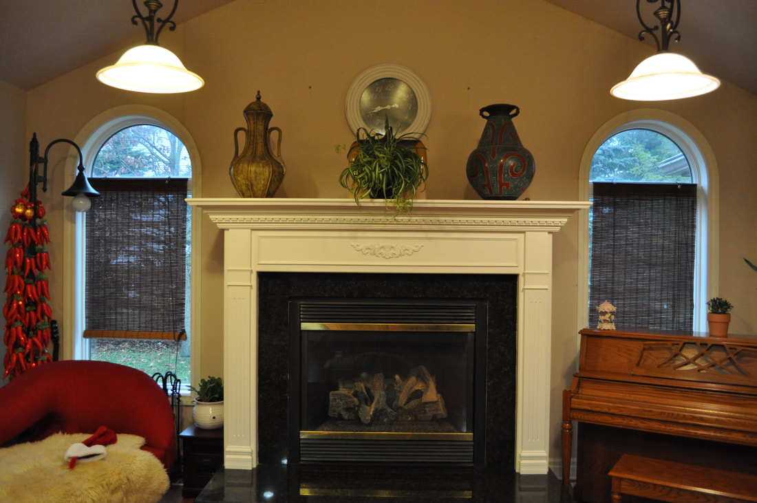 Balance is the usage of visual weights in the image to provide the viewer a sense of "balance" by looking at the image using multiple different ways to show it. A photographer may use lighting, objects, or transparency in order to show balance in an image. Movement When a photographer uses movement in an image it gives the viewers a sense of movement. Most images that involve movement have the actual moving part become blurry which is actually the part of the image that gives off the sense of movement. It could very much not have this blur, some movement images are simply pictures of people moving. Repetition and Rhythm Images that often use Repetition and Rhythm often use patterns or textures that quite often repeat multiple times in the image. Rhythm is just how often this pattern is repeated. Combining these two create a pleasing to the eye image mainly because the human brain often enjoys patterns. Emphasis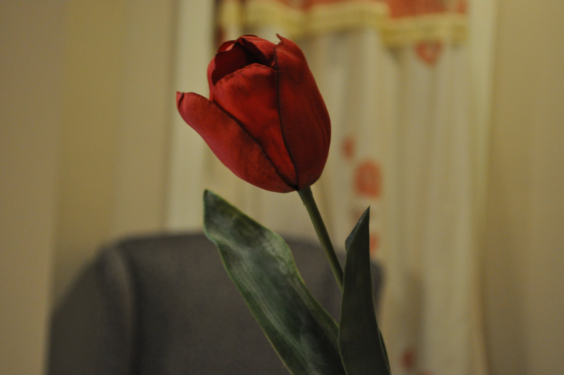 Emphasis is used in an image often by increasing the viewers attention to a certain part of the image, emphasizing an object or something important. Simplicity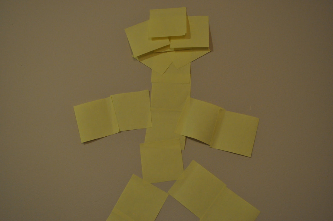 Images that use simplicity is rather simple. In order to use simplicity all you need to do is to keep a smaller amount of subjects, solid colors, or less usage of complicated imagery. Simple images often convey something complicated by being simple. By removing or not paying attention to details it directs the attention of the viewer's eye elsewhere. Contrast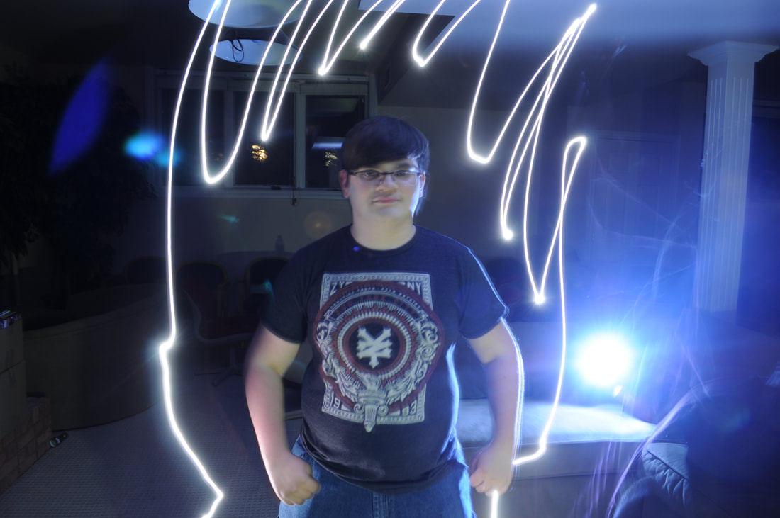 Contrast in an image is pretty simple. Having a subject that pops out from the rest of the image is contrast or having a different color with a solid color background would make it contrast. Contrast is literally just placing two very different things by each other. Proportion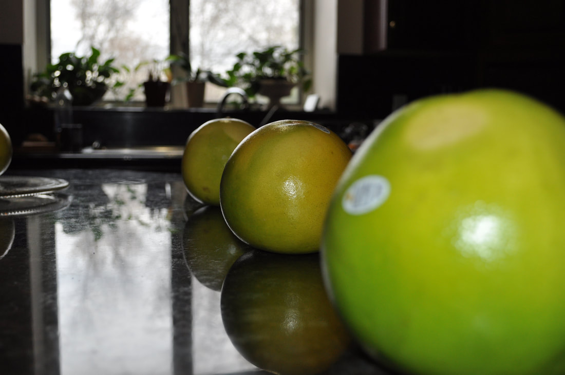 Proportion involves comparing the differences of two different things except using relative information, similar to contrast. Proportion often involves the amount, size, or space something has or is taking in an image. Contrast mainly has to do with intensive properties of the subject. Space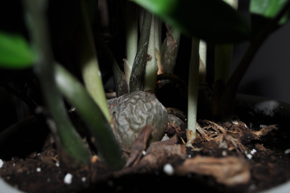 Space often refers to the amount of distance between things. There are two types of spacing in photography, negative and positive. Positive spacing is the space the subject of the image is occupying, and negative is the opposite. Using spacing you can decide what the subject of the image is. Unity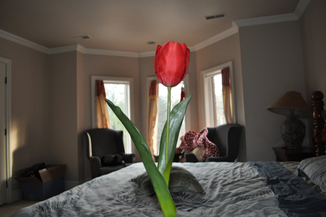 Unity in an image is the usage of at least multiple different principles that was mentioned above. Good usage of unity is simply just good usage of whatever you choose to combine into an image. for example an image with unity could be a really good image of spacing combined with balance.
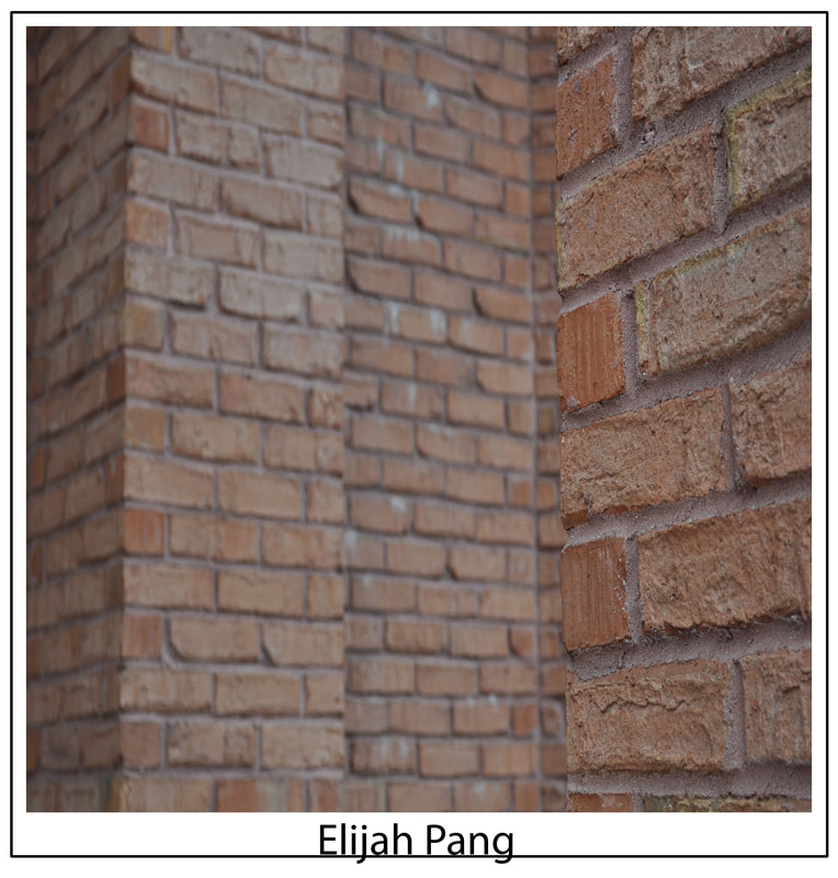
It is I, Elijah Pang. I have returned because it is now a new school year and a new trimester so I'm of course beginning the next class of Digital Photography.  |
AuthorI like sleeping Archives
February 2020
Categories |

 RSS Feed
